Question: Do you have a favorite web browser? It’s a rhetorical question not only because I can’t hear your answer but also because I know you do! But have you ever stopped to consider that your favorite web browser isn’t everyone’s favorite web browser? If you have, kudos! But if you haven’t, you’ve just discovered why it’s crucial to design a website for cross-browser compatibility.
As a Charlotte web design company, these are the things that we think about so that you, internet user, don’t leave one of our client’s websites because it’s not working with your browser. Not everyone has the patience to try a different web browser and instead, they say, “I’ll go to a different _______.”
Why? Just Why?
Why are web browsers like this? Why aren’t they all just built the same? That isn’t a question I can answer but what I can tell you is that each browser has a different rendering and JavaScript engine, which means there are slight variations to how Chrome interprets HTML, JavaScript, and CSS versus Safari. How do you work around this? How do you design a cross-browser compatible website? Some of it is complicated and for that, I recommend hiring a professional, say, a Charlotte web designer, but some things you can do yourself.
Complicated Things
The complicated things you might not know about are the existence of web standards, which are guidelines and specifications defining how all things web should work. There are actual organizations for this such as the World Wide Web Consortium (W3C) and the Internet Engineering Task Force. Tools like W3C Markup Validation Service and the W3C CSS Validation Service check code for errors and warnings.
The other thing we do as a Charlotte web design company is progressive enhancement. We start with a basic version of your website that works on all browsers and devices and then add more features for browsers that support them. Essentially, if a browser can handle bells and whistles, we add metaphorical bells and whistles.
It’s also important to design websites that are responsive, or in other words, respond to various screen sizes, resolutions, and orientations. A website that looks amazing on a laptop could look like trash on a cellphone. That’s why we use flexible layouts and fluid images.
Flexible layouts use percentages, ems, or rems to define width and height so they aren’t fixed units like pixels or points. So instead of sizing the width of a page as 800 pixels, we’ll say “full screen” so the web page takes up the full screen of whatever the device. The process is similar for fluid images – we use a max-width property to scale images proportionally. For instance, take up half of the container as opposed to all of it.
DIY Things
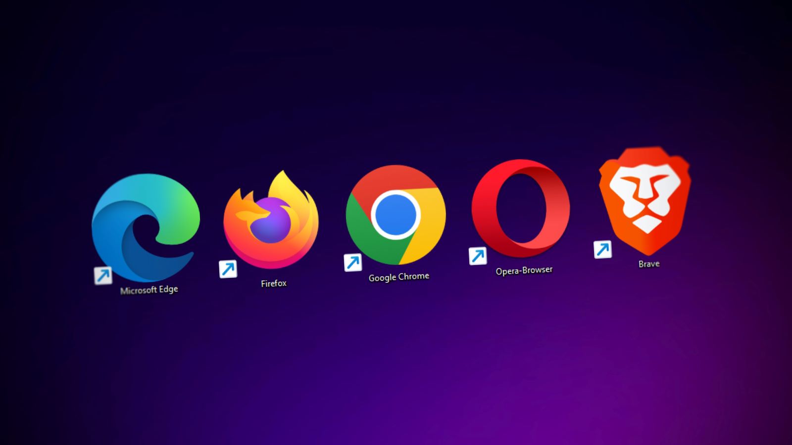
For you DIY fans, you can literally test your website on different browsers and devices. Open it up in Chrome, then try Firefox. How does it look in Safari? Then do the same thing on a tablet and a smartphone. If you don’t like what you find, at least you know what to focus on. But if it feels too complicated because how do you even adjust where a picture goes on a cellphone versus a laptop? Contact your favorite Charlotte web designer. (By that, I mean us).
There are also tools to support cross-browser testing such as, well, CrossBrowserTesting, but also BrowserStack, and LambdaTest.
The final why
Ultimately what this all comes down to is you want a beautiful website that works on whatever browser people are using. You can’t bank on the fact people will only view your website using Safari and that means creating cross-browser compatibility. I know it’s tempting to build a website and assume it will look good everywhere and on everything but you know what they say about when you assume. . .
Instead, your safest bet is to hire a web design company, maybe even a Charlotte web design company, and have them test these things. There are tweaks, tips, and tricks they (we) can employ to give you the website of your dreams. Because after all, this is about creating something people will look at over and over again.
We’re just a phone call away at (704) 336-9113, or send us an email if you’d rather. We look forward to hearing from you.