When your potential clients visit your website, they’ll decide within a few milliseconds (really!) whether they want to stay – and buy – or want to click away. The design can make or break your business. As a Charlotte web design company, we’ve learned what does and does not work when it comes to website design.
Here are three elements to a visually pleasing website:
#1 – Call-Out the Important Stuff: When a user looks at a website, they should be able to easily categorize the most important elements of the page just by looking at the design. Making a “buy it now!” button bright yellow draws attention to it. A large photograph of your best-selling product also stands out. People are also overwhelmed by too much information, so simplify drop-down lists as much as you can.
For example:

The website sections that viewers tend to spend the most time looking at are, in order of time spent:
- The company’s logo
- The navigation menu
- The search box
- The site’s main image
- The site’s written content
- And the bottom of the website (the footer).
Thus, you should ensure your “call to action” is part of these elements – or close by.
#2 – Less is More: Don’t overwhelm the design with lots of texts or pictures. White space can be a powerful tool in design. You want to communicate a message, not overwhelm your reader. White space emphasizes the elements that you do choose to add to the site, and it also makes the page look classy and upscale, not cheap.
Google’s homepage is a perfect example of a clean whitespace design:

#3 – Your Copy Counts: What you say is important, but how you present your text on the screen matters, too. Remember to keep sentences short – no one wants to read a run-on sentence! You’ll also want to keep paragraphs short to avoid long blocks of text. And draw the reader’s eye to important information with elements such as bullets, numbered lists, section headers, or elements like bold text, italics, or underlines. Be sure to check grammar and spelling, too.
On our homepage, we break up text to make it more readable, like this:
Here are a few examples of websites that we’ve created with the above principles in mind:
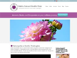
Dahlia Natural Health Clinic
Vitamins for Vegetarians

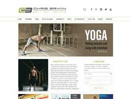
Chris Bryan.com
If you’re interested in hiring a web design company, connect with one of the most well-known Charlotte web development companies, Web Symphonies. We’d be happy to help you design a powerful and effective site.